Charts are a good way to analyze information. As a rule, they are necessary when it is necessary to distinguish between any business data showing the company's profit for the year, or scientific information showing, for example, how the temperature changes in each month in a certain place. Using Microsoft Excel for charting is a great way to make charts that look professional at work or school. However, not everyone knows how graphing works in Excel. The following is a brief description of the steps that you must follow to create a chart in this editor. Various other graphs that can be created - lines, histograms - are performed in a similar way. This example is provided in Microsoft Excel 2007 for Windows.
So, to get started, open the Excel 2007 editor on your computer. Enter the desired data category for the information you want to compare by placing it in different columns. Each category should be entered in a separate cell, starting with A2. The example in this article creates a graph in Excel that displays fuel, clothing, and entertainment expenses.
Then you must make the X axis labels in row 1. Each label must be in a separate cell, starting with B1. For example, in the case of systematization of expenses, you can choose four months.
Enter the required values for the Y-axis in the desired cells. The data should match the X-axis and category information. In this example, we can note the amount of money spent on each item for each month, rounding the amount to a convenient value.
Select the entered information in the table by clicking in the upper left corner of the table, and then dragging the mark with the mouse over the entire data range.
Click on the “Insert” tab in the menu located at the top of the screen. This item will be located in the second tab on the left side.
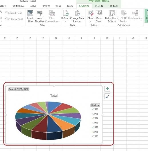
Select the type of chart you want to use to represent the data by creating a chart in Excel. A histogram is best suited for the above data, because it shows well the different variables of the X axis that represent different data. Keep in mind that data is displayed differently depending on the type of chart. These varieties are listed in the center of the menu. You can choose from columns, line, pie charts and more. The histogram will be displayed in the drop-down menu of designs after clicking on the corresponding item.
Choose the type of chart that is best for the data entered into your chart in Excel. When you place the cursor on the corresponding option, you will see its description. For example, if you select “2D chart”, it will be displayed in the appropriate form in your table.
Click on the created chart in Excel, and then on the “Layout” tab. To add a name to the entire chart or its axes, simply click on the “Labels” tab. A drop-down menu will open in which you can select the necessary parameters. Make changes to the names and fonts as necessary by clicking on the text and performing subsequent editing.
After formatting and editing the chart, you can copy and paste it into other documents. If the copy and paste functions do not work, you can always try to take a screenshot and paste the created graphs in Excel 2007 into any selected document as an image.