In this article, we will consider some of the most popular types of graphs: a line chart and a petal chart. First of all, let's talk about the purpose of these species.
Line chartDesigned to monitor changes in several quantities during the transition from the start point to the destination point of the graph. This type of graphic image is used to characterize the relationship, variation and dynamics. The signs of geometry in this case are broken lines consisting of points and line segments.
To characterize some dynamics, a linear diagram is used in such cases as:
If the number of levels of the time series is very large. The application of the diagrams under consideration in this case will emphasize the continuity of development.
Display of the total trend and nature of the development of a process or phenomenon.
Comparison of a certain number of time series.
Compilation of growth rates.
Features of construction: when drawing up a linear diagram, the abscissa axis, as a rule, is temporary, and the ordinate is indicative. On one graph of the type under consideration, it is possible to construct several broken lines, which allow you to compare changes in different speakers over a similar time period.
Petal chart
Designed for a comparative view of the part of the values of a certain number of homogeneous series.
Features of its construction: the graph has separate axes for each selected category of values. All of them, in turn, have a single beginning. As a result of construction, as a rule, a curvilinear polygon is obtained, tending to the shape of a circle, which is achieved on the graph for equal values of the considered indicators. This graph is presented in an angular / polar coordinate system, which is based on a change in the considered values of the angle of inclination to the axis. Each line is vector, therefore, this type of diagram is a good form for comparing certain trends.
All charts are easiest to build in the spreadsheet editor Microsoft Office Excel. To do this, there is a "Chart Wizard in Excel."
Step-by-step instruction for work "Wizards for building diagrams"
Opening an Excel document. Start - The entire list of programs - Microsoft Office - Microsoft Office Excel.
Formation of data for construction in a tabular form.
Opening the “PD Wizard”: Insert - Chart / Graph.
Choice of chart type: line chart (bar chart) or petal chart.
The choice of data source to build. Rename / set the name of the series.
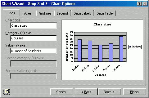
Setting the parameters of the future chart. The name of each axis, the name of the chart as a whole. Axis category selection. Show / hide the main / intermediate lines on the chart. Show / hide the legend, where the legend is a tabular form of the signature of the series. Inclusion / hiding in the signatures of the names of series and categories, as well as values (for some other types of diagrams - shares and sizes of bubbles). Show / hide the tabular data form in the area of construction of the chart itself.
Selecting the location of the final result (work sheet or new sheet of the book).
On this, the work of "Wizard for charting in Excel" can be considered completed. The whole process with a competent approach using this instruction (excluding input data) takes no more than fifteen minutes. Try it, it’s not so difficult!