The three primary colors — red, blue, and yellow — are part of the color palette. Opposite, or complementary colors give a variety of shades from their derivatives by mixing and coloring. Sometimes it’s difficult to choose the outfit you like for your appearance. Given the age categories, type of person, as well as the structure of the figure, you can experiment with the color scheme and choose the right tone of clothing. Each color type has its own palette, which can emphasize advantages and hide flaws. To do this, it is enough to know the basics of the correct combination.
In a circle of Itten
The theory of the “color wheel” makes it possible to present a palette of colors visible to our eye. Itten's circle has an exhaustive palette. But should it be narrowed to 10 shades and divided by their radii, complementary colors will be clearly visible. This theory is a good help for creative people. The design of clothing, interior design is due to the whole system of the color wheel.
Main combinations
There are many ways to combine colors. The following are considered priority:

- Monochromatic. This is a game with one tone and its shades. Combining your style, the emphasis is on a dark and saturated subject, additional things are already selected for it, more muted colors. A neutral tone will help to dilute such an image, and pastel ones will give lightness and femininity.
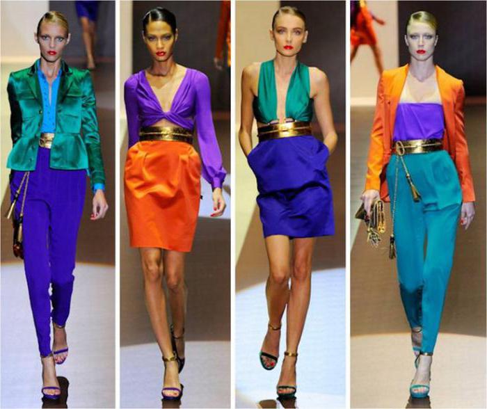
- The triadic is the contrast in the three primary colors. Such a composition creates a bright and dynamic union. In the 70s, the emphasis of fashion trends was based on the main palette. They were a component in the choice of style. Such a characteristic mix made it possible to be fashionable and at the same time to remain oneself.
- Achromatic combination. A game of black, white and gray. This is a classic. This range is suitable for women of any age and with any figure. A black suit with a white shirt is always true. This kit looks very progressive. Gray was not perceived for a long time and was considered boring. But in the context, with the right tones, it looks different. Recent fashion trends welcome this color and its shades.
- And the complementary color combination closes the list. It is based on full contrast.
The role of color in clothing
Complementary colors are the most difficult when choosing clothes, and at the same time the most spectacular. Each woman perceives and reacts to color in her own way. There is no specific tone that everyone likes, without exception. Some like saturated ones, others like more calm ones.
Red is the brightest and most challenging, able to inspire confidence and excite the imagination. Wearing a red dress and complementing it with green sandals, you will be on top. In this outfit, a woman will like herself, which means she will receive the approval of others.
Game in contrast
Do not be afraid of contrasts. A complementary combination of colors in clothes is always a win-win option. New stylistic images allow you to select a kit, focusing on the variation of shades. Complementary opponent colors of green and red, yellow and blue will attract the attention of others. Multi-colored fabrics will create a slightly daring and bold bow. The main thing is not to overdo it. The shades of the fabric should be clearly balanced, and the texture of the objects is almost identical. The diverse structure of the fabric is also welcome in modern fashion, it is important to know its exact application in a particular kit.
Stylists advise
Women who prefer pastel and warm colors in their wardrobe can contrast one thing. Or choose related-complementary colors. These are more muted tones, located next to the main ones. Additional shades complete with the main are in perfect harmony. If it seems that the image is rustic, it can be freshened up with a sharp-fashionable bright scarf or other accessory that always attracts the eye. Stylists base their fashionable guidelines on many factors. For a complete combination, it is not enough to choose one main element of clothing. We must not forget about the small details, the choice of shoes. Compliance and integrity should be in everything.
Harmony of colors
The choice of a color must be harmonious. Looking around you will realize that nature itself prompts and directs to the right decision. For example, observing the flowers, you can see the complete harmony of nature. This will serve as a source of inspiration, and complementary colors in clothes will create an unforgettable set.
Black and white
Individual colors can be in harmony with almost the entire color palette. Such as white and black. They play an important role for the modern fashionista. These are the main components of her wardrobe. A business ensemble cannot do without this couple. Of course, it can be diversified and make a bright detail, so as not to look too strict. Blue gives an unusual kit paired with gray. It will be strict and soft at the same time due to contrast. Focusing on the main gray detail, the second color fades into the background a bit. Muted contrast creates a good impression. Green and its shades are always held in high esteem. Things of this coloring always look stylish. Of particular interest is the composition of green and dense blue. Combining incongruous, the image looks quite correct and, accordingly.
Combining bright colors in one set, do not be afraid to experiment. With the help of various trends, beat and complement the image. As a result of the right combinations, a stylish, boring look will be provided to you. And most importantly - you will be unique in your outfit.